Monday 28 February 2011

Multimedia (game/web)

Game design (The total war series)

The total war games are designed and played on PC, it is a strategy battle game and has loads of games in its series,  these games include... Shogun (2000), medieval (2002), Rome (2004), Medieval 2 (2006), Empire (2009), Napoleon (2010) and finally shogun 2  that is soon to be released. the graphic quality between the first and second is incredible. the use of more advance programing and application of techniques such as Ray tracing (giving added thought to light and how it effects an object), applying a better understanding of human anatomy (how the figure moves and reacts to things) ect ect.
Shogun screenshot

as you can see for 2000 the graphic detail was OK for the time but by today's standards isn't very impressive as the units are not very detailed they dont move individually, and are pixalated not allowing you to zoom very far in. 
The scenery is not detailed and rely s on colour alot, for example the sand is only distinguishable by the sandy brown colouring and the water is stationary so again its only because its blue that we understand what it is. 
 unlike in later games in this series objects, buildings and other scenery are few and far between creating a empty and rather boring battle.
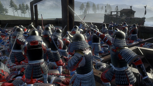
Shogun 2 screenshot


this is the newest release in the total war series, as you can see the change in quality is amasing this is an actual in game shot zoomed in on a unit, the detail is ridiculous with incredibly realistic textures and surfaces on the the units and the environment around them, also all the units move individually giving character to individuals and adding realism, this allowes the gamer to get way more involved with the game.


The sence of realism in modern games/ technology has a huge impact on the player due to the fact the player will for a kind of relationship with the in game characters, this is ultimately a good thing as the player will get a much better gaming experience.
This advance in gaming and tech isnt all good though due to the fact people will much easily become obsessed and addicted to these game, this is sparking wide controversy amongst the media after an incident in Korea where a couple got so addicted to playing a second life game where they had to look after a virtual child they allowed their reall life baby to starve to death!      

Monday 14 February 2011

Optical illusions and visual effects

Optical illusions

generally are a picture that at a glance you see an object but once you pay more attention to it sometimes will come out of the page at you or can give the impression of movement and sometimes will reveal a completely different object/ image altogether.

this one messes with your ability to judge perspective, giving the impression that the top of the image is looking up at a balcony or roof top and the bottom is some kind of garden.


this one give the impression that the bottle is 3D when really it is only a poster on the side of the lorry, this will only work at a certain angle.


this one at a glance looks like an elderly couple but on closer inspection reveals a 3d challis and on even more attention reveals highly detailed images within their faces. 

Stereo-grams

this sort of illusion takes alot of effor to get it to work you need to train your eyes to focus on the 3D object in the image at first it is rather frustrating but once you master it it can be stunning and sometimes rather scary.


once you focus correctly a 3D butterfly will start to come out at you from the center of the page this is the first one i manege to see (after trying loads of the things!).
 

this one is meant to give the impression of a whirl pool spiraling out of the screen towards you. at a glance it just looks like a mess of colour and can hurt your eyes if you don't focus right. 


in this stereo-gram animation you should (eventually) see a snowman animation, its very hard to see compared to the still images but once you get it it looks insane! 


Monday 7 February 2011

Ways of seeing (advertising)

Advertising  

companies have always used adverts to try and sell their products since forever, they are an extremely effective way of selling generally by emotionally manipulating us. the most common way of manipulation is through jealousy or envy making you look at the beautiful/successful people on the add and thinking that by purchasing whats being sold their life will get better or they will be more attractive.


 Perfume add
 these sorts of adds are a perfect example of advertising with envy. at a glance its a massive, good looking woman not wearing a lot holding some perfume, but the psychological meaning behind this images is making out that by using this perfume the opposite sex will find you attractive and the fact she is towering over the city gives a sense she is powerful and successful again reinforcing the fact that you will be admired, sexy and successful if you use this product.  

    Clothing add
 again a perfect example of making people mainly girls feel like they need something or by purchasing something will give them a certain social status. all that is in this image is a horse, a pretty girl and some expensive looking clothes. but the psychological effect is massive! starting with the horse its a well known marker off social status you automatically assume that if somebody has such a perfectly white horse  they must be loaded! again this gives the impression of class. then moving on to the girl the fact that she is pretty alone makes her desirable  then by making her have these expensive looking clothes and head piece adds to the idea of class.

 Shock Advertising

Other examples of advertising include "shock advertising" mainly used in campaigns like raising money for the disabled or making people think twice about smoking. as the name shock advertising suggests they are intended to shock/disturb. 


this is a prime example of a shock advertisement, the use of the gory/disturbing images catches the readers attention and makes the image stay on his/hers mind, then the simple head line gives a simple message that will make you think. in this case that to many people get hooked on smoking and that you shouldn't to or if you already are to make you think about stopping.


this is an advertisement to encourage careful driving around schools by placing a flyer of a child on you windscreen making it look as if you hit one! again this sort of campaign hits hard and creates mental images that create fear and make you think about the subject constantly.


Propaganda

this for of advertising is generally used as for getting across an idea or to get the reader to think something rather than to purchase something it was used alot in the first/second world war to enspire young men to join the army and to enspired people left at home to do their part.


 this is a group of posters designed to inspire the British public  to do join the war effort, that in most cases was aimed at young men to join the British armed forces portraying the army as glamorous and heroic but the reality was completely different.


this is another poster from wartime Britain it kind of borders on a shock poster, as it has a very strong image of a innocent looking woman labeled as a murderer, this grabs the readers attention then when they are drawn in gives the important message not to talk carelessly. 

Monday 31 January 2011

The C.R.A.P Princible

The C.R.A.P acronym stands for Contrast, Repetition, Alignment and Proximity.   

Contrast 
Elements that aren’t the same should be very different so they stand out, this is so the user doesn't subconsciously make links between images that aren't related. for example the main image or focus poiont should stand out from the background.


Repetition 
you should repeat the same styles/theme down the page for a sense of consistency. this ensures the user doesn't get confused and knows they are on the same sight! as you can see the sight below uses the same far eastern theme all over the page both setting the scene and using repetition.

Alignment
Everything on the page needs to be visually connected to something else, nothing should be out of place or distinct from all other design elements. again below all the sight follows a single column down the center. 


Proximity
Proximity creates related meaning: elements that are related should be grouped together, whereas separate design elements should have enough space in between to communicate they are different. a good example of this is youtube as they have different sections for different videos.


Monday 24 January 2011

Geoglyph

 Geoglphs

Are rather epic symbols carved into the landscape it is hard to tell what the point in them are, my view is it may have been some kind of tribute to their gods as they only really make sense from the sky.

Pictograms

 Japanese Pictographs

  Pictograms much like Ideograms are  pictures/symbols that represent ideas/concepts, but unlike ideograms they portray a more understandable scene rather than symbol.

the Japanese are famous for mixing Calligraphy with their art work, so in a way most examples of Japanese/Chinese art will contain both pictograms and ideograms (to a certain extent).

in the above picture it is strongly image based with lots of colour, and lots of elements to draw the eye and combined with the symbols will tell a story, all tho due to the fact I cant read these i am unsure as to the story behind it.

ideograms


Chinese Calligraphy (Ideographic Writing)

Ideograms or in this case ideographic writing are basically pictures/symbols that represent ideas/concepts, much like a Pictogram but far less obvious and far more abstract.

possibly the most famous form of Calligraphy but you may not realize is that the Chinese symbols not only look beautifully artistic but are also ideograms. most of them describe something with rudimentary shape of the subject developed into the symbol itself, giving the letter/symbols more meaning, for example the symbol for human resembles legs so as well as meaning human it also looks like one to.

Cave Paintings

Hand Paintings

The picture above show cave paintings from tens of thousand of years ago, they depict the hands of the ancient tribes from the Santa Cruz province in Argentina. This is believed to have been done by placing your hand on the wall and spraying paint from your mouth onto your hand/wall leaving the silhouette of your hand. This is kind of life early spray painting.

I believe that this is a way of showing a close community, having each of the tribe members to create one of these allows us to see how big the tribes were. Or that stamping boys hand on the cave wall was used to symbolise a him turning into a man.

Cave Painting

this is the most common type of cave painting involving some kind of hunt/chase involving men hunting all sorts of animal, normally deer or buffalo , depending on what part of the world they lived in. the hunters are using bows and arrows, spears an clubs this tells us they had tools and weapons .

the fact that this sort of seen is so common in cave paintings an the amount of detail tells us how important hunting was to their survival and how important it was in their culture.   

Ai tasks


This a full (12) colour wheel  created in adobe illustrator.


ying/yang symbol created in Adobe Illustrator.


an experiment with colours to create a feel of depth in a picture. again created in Adobe Illustrator.  


Wednesday 12 January 2011

comic strip and Flash adventure ideas

This is an initial idea for a comic book layout, the "window" sections will be were i place the images. i have attempted to make this look as metallic and dark as possible. ive also included the biohazard logo to fit with the theme of my comic.
 this is a design 
for the two Heavy doors in my flash adventure. i created these by making two large Grey rectangles adding lots of textures and effects to give a metallic look then added the warning markings cut it up and made it look damaged, then i made the doors inter lock to add realism.


Stokes croft collage

this is a collage me and a few class mates created as a project. we spent about half a day gathering images of street art in stokes croft, the idea was to gather lots of images together and make them look right together in an image, also we had to give the collage a sense of depth. in order to give  the sense of realism/depth i added the brick wall over the top reduced the opacity and change the layer style to 'overlay' giving the feeling of one big graffiti scene and not lots of small ones. then to add more depth i added the security camera to the wall. all this was done using Adobe Photoshop.

consumerism collage

Horror Poster


A horror movie poster i created as part of a college project, it involved a huge amount of masking, blend/ layer styles and other techniques.